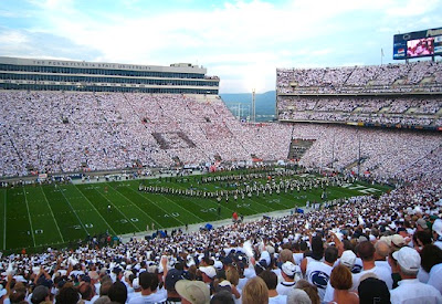
It a stadium environment, gold gets swallowed; it's washed out. The GOLD OUT looked horrible on TV because the stands looked...dirty. That's an odd descriptor, I know, but it's the best way to describe what I saw. We need a dark/bold color that will pop in contrast to other colors. Reds, oranges, some greens, blues do that; gold doesn't. I know our school colors are old gold and white, but in a game environment, it just doesn't work for TV.
Not interested in black. That belongs to that other team.
Navy blue is a secondary color, and is the only thing we have that fits the optical bill for a stadium. As much grief as I give some fonts on this topic (
@Supersizethatorder-mutt), I am a traditionalist too. I understand the desire for "white and gold," but let's be real: if we want to "show out" on tv, we won't be wearing gold. (mustard--a la 2006 jerseys--might work)


