Major Branding Announcement: New Tech Gold

iceeater1969

Helluva Engineer
Messages
9,667
By the way on both shirts, white polo and gold tee, there is no blue trim or lettering
On the white polo the very thin border is black on the gold Gt. Hard to tellbit is not blue due to narrow width.

As an old timer i would be pretty excited to see throw back with a major Adidas touch= basic bad *** black shoes w 3 stripes, gold pants with 3 narrow pin stripes , shirt w flare, and shiny gold honey comb helmets. Adidas could do great things with White and Gold!.
Let the disagreements begin.

 

dressedcheeseside

Helluva Engineer
Messages
14,220
By the way on both shirts, white polo and gold tee, there is no blue trim or lettering
On the white polo the very thin border is black on the gold Gt. Hard to tellbit is not blue due to narrow width.

As an old timer i would be pretty excited to see throw back with a major Adidas touch= basic bad *** black shoes w 3 stripes, gold pants with 3 narrow pin stripes , shirt w flare, and shiny gold honey comb helmets. Adidas could do great things with White and Gold!.
Let the disagreements begin.
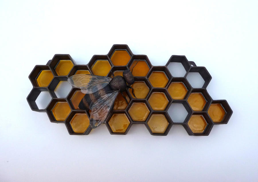
I'm not opposed to honeycomb graphics if done well. No friggn' bubble wrap or chicken wire. There's some good stuff out there, you don't have to reinvent the wheel. I like this design w/o the bee. It would be badass on a helmet.

honey_bee__honeycomb_sculpture_by_jeremymaronpot-d2zhj8t.jpg


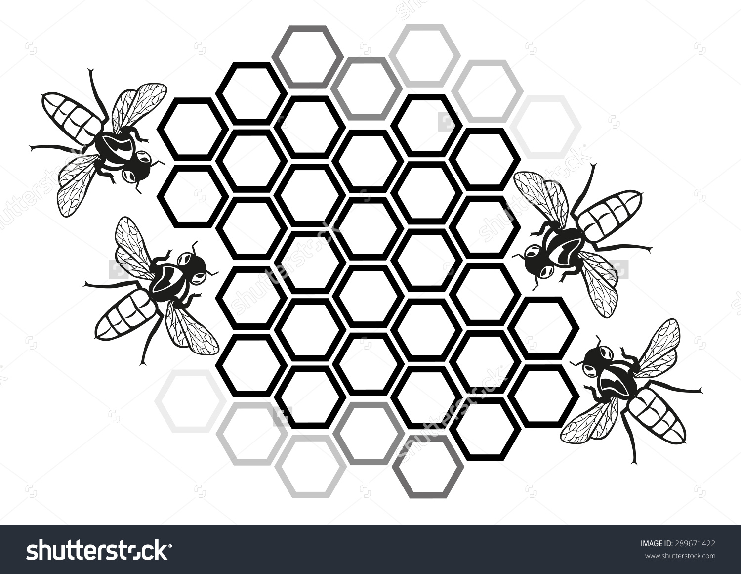
Separating the cells makes it look less like chicken wire. Again, delete the bees.

honeycomb-formation-clipart-18.jpg
 

JacketFromUGA

Helluva Engineer
Messages
4,897
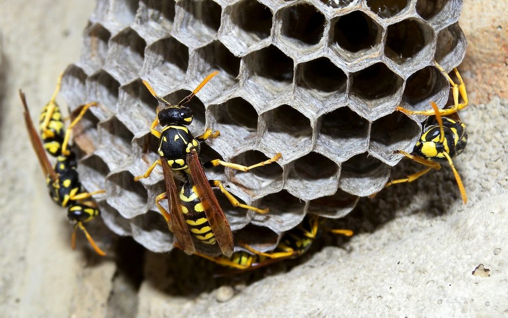
I think the hexagon pattern if used correctly could be cool if they made it clear it wasn't honeycombs. I know people will always call it such but Yellow Jackets don't make honey.

Instead the hexagons that yellow jackets make are in their nest

yellowjacket-nest.jpg

I think it could be a cool branding to turn a part of Bobby Dodd into "The Nest" and have the hexagon branding stem from that.
 
Messages
13,443
Location
Augusta, GA
By the way on both shirts, white polo and gold tee, there is no blue trim or lettering
On the white polo the very thin border is black on the gold Gt. Hard to tellbit is not blue due to narrow width.

As an old timer i would be pretty excited to see throw back with a major Adidas touch= basic bad *** black shoes w 3 stripes, gold pants with 3 narrow pin stripes , shirt w flare, and shiny gold honey comb helmets. Adidas could do great things with White and Gold!.
Let the disagreements begin.
The Adidas shirt which I ordered and received from Fansedge has a very dark Adidas logo, trim around the GT and "Georgia Tech". I am pretty sure that "very dark" color is black and not blue. It looks terrific.
 
Messages
13,443
Location
Augusta, GA
Endzones and baselines done in the hexagon pattern could become as well known as the checkerboard pattern from that school in the state above us.
Possibly, if they were done right. But the pattern on the helmets doesn't show at all from a distance. If the patterns were done like the one with the bee that cheese posted, they could at least be seen. Just an unfilled hex pattern doesn't do a thing for me.
 

AlabamaBuzz

Helluva Engineer
Messages
4,020
Location
Hartselle, AL (originally Rome, GA)
Possibly, if they were done right. But the pattern on the helmets doesn't show at all from a distance. If the patterns were done like the one with the bee that cheese posted, they could at least be seen. Just an unfilled hex pattern doesn't do a thing for me.


It must be filled with "TECH GOLD" :)
 

iceeater1969

Helluva Engineer
Messages
9,667
I'm not opposed to honeycomb graphics if done well. No friggn' bubble wrap or chicken wire. There's some good stuff out there, you don't have to reinvent the wheel. I like this design w/o the bee. It would be badass on a helmet.

honey_bee__honeycomb_sculpture_by_jeremymaronpot-d2zhj8t.jpg


Separating the cells makes it look less like chicken wire. Again, delete the bees.

honeycomb-formation-clipart-18.jpg
Very good. I like it.
Makes for more Buzz at BDS.

Could smaller black combs be in the shape of Gt set on background of lighter colored.

I like black but am good if we use navy.

Great job on the honey combs
 

GTBatGirl96

Jolly Good Fellow
Messages
386
Regarding the hexagon pattern, if you downloaded one of the desktop images from the gtathl.com site, you can see the hexagons around the image, but closer to the outside of the graphic, it transitions to more of a circuit-board-ish image. If they are making an effort to emphasize the rambling wreck logo over Buzz, maybe they will also be transitioning from the hexagon/honeycomb to the circuit board? (which is a lot more high-tech and looks pretty cool, imo)
 

MidtownJacket

Moderator
Staff member
Messages
4,862
My quarter zip CPJ Special is shipping. Still waiting on back ordered gold shirt and full sleeve quarter zip.

Also the coffee mug with the new word mark is back ordered still.

Oh well, I ordered Saturday afternoon on the release weekend so glad that people are buying. It bodes well for excitement about this upcoming season in all sports.


Sent from my iPhone using Tapatalk
 

Whiskey_Clear

Banned
Messages
10,486
I think the hexagon pattern if used correctly could be cool if they made it clear it wasn't honeycombs. I know people will always call it such but Yellow Jackets don't make honey.

Instead the hexagons that yellow jackets make are in their nest

yellowjacket-nest.jpg

I think it could be a cool branding to turn a part of Bobby Dodd into "The Nest" and have the hexagon branding stem from that.

Sure. Just as soon as we can start coming close to filling the place first. Otherwise we will just be known as “the empty nest”
 
Top