Dottie1145
Helluva Engineer
- Messages
- 2,225
This is the CPJ special, expect to see this one a lot come fall camp.
This is the CPJ special, expect to see this one a lot come fall camp.
This is the CPJ special, expect to see this one a lot come fall camp.
")
I'm not crazy about the 45 degree thing either, but whatever...just be consistent.I like 98% of this. Good job GTAA. As others mentioned, I care more about consistency than whatever it is on its own. Good start.
On the 2%, I like the idea of the Tech Tower font. Only minor gripe would be those 45 degree marks in the letters G, R, H, etc. Are those actually part of the Tech Tower font? I could be off on that. I'm not a marketing guy... just seems like a little bit of overthinking.
And am I the only one that shivered just a wee bit when looking at the woodmarks?
View attachment 3496
I'm not crazy about the 45 degree thing either, but whatever...just be consistent.
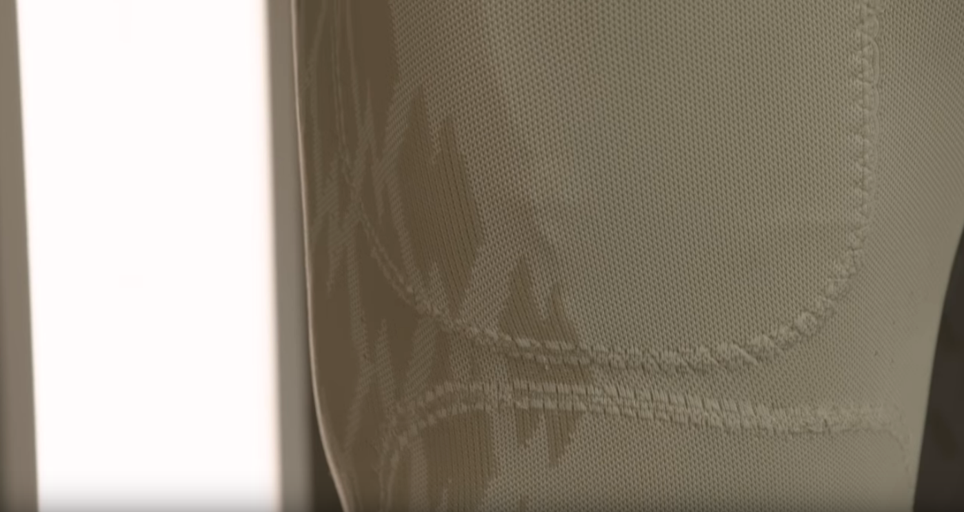
Adidas tire tread spotted.
It is clean...I’ll probably own one tooI bought that. It’s a little too advance for his style lol
Adidas tire tread spotted.
I like 98% of this. Good job GTAA. As others mentioned, I care more about consistency than whatever it is on its own. Good start.
On the 2%, I like the idea of the Tech Tower font. Only minor gripe would be those 45 degree marks in the letters G, R, H, etc. Are those actually part of the Tech Tower font? I could be off on that. I'm not a marketing guy... just seems like a little bit of overthinking.
And am I the only one that shivered just a wee bit when looking at the woodmarks?
View attachment 3496