2019 GT Official Color Debate (formerly Adidas Swag Watch 2019 **

Ibeeballin

Im a 3*
Messages
6,081
I love Tech, but I know a lot of Tech grads that over think things. They're incredibly smart but lack common since and sometimes the they will complicate the most simple things. Let me say that this isn't every Tech grad, but some. I actually went to SPSU. My freshman year I would go down to Tech on Saturdays and meet with my friends to hangout before the games. One time my friend's dorm was having a cook out before the game and you should have seen these 5 guys trying to start a charcoal grill. They made it seem like rocket science, talking about the chemistry of the charcoal and what not. I had to step in there and start it for them. Ever since then I noticed that Tech operates a lot like that story. They over thing the simplest things. Most things aren't rocket science and take common simple since to solve.

I don’t agree with much in this thread, but this is the fundamental issue with at the Institute
 

slugboy

Moderator
Staff member
Messages
11,503
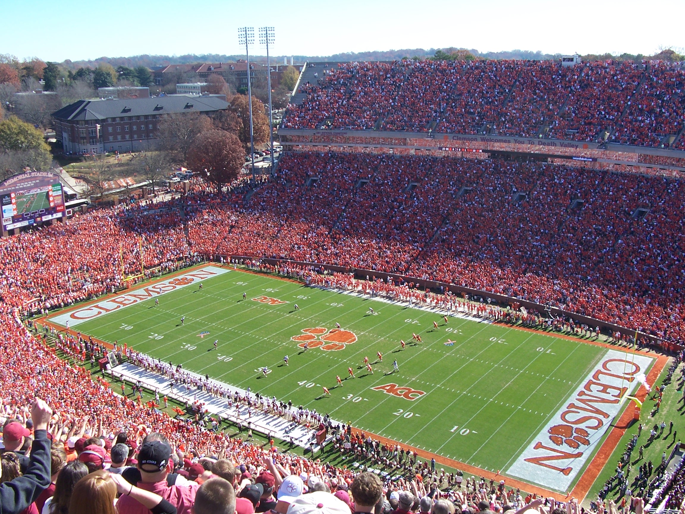
If somebody doesn't think a white endzone would pop, they are blind. But, gold letters on a white background would definitely need some kind of trim on them to make it really look good. I think the trim should be black, but I would begrudgingly accept blue.

The sidelines and end lines are white. If the end zone is white, as far as the refs can tell everything looks out of bounds.
Blue contrasts with the boundary lines and the gold letters. You can go right to the boundary, so you can see when someone steps out. It’s a smart pick.
We almost lost a touchdown last week because Malachi Carter had white shoes on, and the refs couldn’t tell if he was on the line.


Sent from my iPad using Tapatalk
 

TheSilasSonRising

Helluva Engineer
Messages
3,729
View attachment 7211

Can we just keep this all season. I get that the grounds crew is award winning an all but there's something to be said about consistency. Solidify the brand instead with consistency of changing it each week. The only thing that would make this better would be to add a gold boarder around the end zones up to the 25 yd line instead of white. The reason the GT doesn't pop is because it's Tech gold on a green base. I'm glad that their using Tech gold and not the yellow they used for years but I think if they put down a white base under the gold that it would pop better. And maybe have the outline of the GT be white instead of navy. Other than that, leave it.

I think that would be great IF the midfield “GT” were outlined in White. Keep it the same.

Would that not also save money? IDK
 
Messages
13,443
Location
Augusta, GA
The sidelines and end lines are white. If the end zone is white, as far as the refs can tell everything looks out of bounds.
Blue contrasts with the boundary lines and the gold letters. You can go right to the boundary, so you can see when someone steps out. It’s a smart pick.
We almost lost a touchdown last week because Malachi Carter had white shoes on, and the refs couldn’t tell if he was on the line.


Sent from my iPad using Tapatalk
That's just garbage. Other schools have white field outlines and white end zones, and they work fine.
 

JacketRacket

Jolly Good Fellow
Messages
435
That's just garbage. Other schools have white field outlines and white end zones, and they work fine.
The only fields i've been able to find with a white end zone don't go all the way to the border, they stop like a foot short. See here:
ClemsonMemlStadium06_original.jpg


We can still do something like that, of course.
 
Messages
13,443
Location
Augusta, GA
Wonder if Clemson folks are complaining because White is not one of their official colors?
Seeing as how they almost always wear white in their uniforms, are you sure white is not one of their official colors, along with orange and purple? Regardless, with two dark primary colors, they almost have to use white. We have gold as our dark color. We don't need another one.
 

chris975d

Ramblin' Wreck
Messages
903
Seeing as how they almost always wear white in their uniforms, are you sure white is not one of their official colors, along with orange and purple? Regardless, with two dark primary colors, they almost have to use white. We have gold as our dark color. We don't need another one.

Ehhh...I think our current gold is why we do use another “dark” color, in this case navy. Our current gold (sand/khaki) is actually a very light color, and isn’t high contrast against white. Even with a blue border around the gold numbers on our white jerseys, there’s all kinds of complaints about legibility at a distance. Our most legible jerseys are the white with blue numbers/gold outline. Or the blue jerseys with gold numbers. So whereas Clemson has to use white because their official colors are both dark (purple and orange), we have to add a dark color because our primary colors are both light.
 
Messages
13,443
Location
Augusta, GA
Ehhh...I think our current gold is why we do use another “dark” color, in this case navy. Our current gold (sand/khaki) is actually a very light color, and isn’t high contrast against white. Even with a blue border around the gold numbers on our white jerseys, there’s all kinds of complaints about legibility at a distance. Our most legible jerseys are the white with blue numbers/gold outline. Or the blue jerseys with gold numbers. So whereas Clemson has to use white because their official colors are both dark (purple and orange), we have to add a dark color because our primary colors are both light.
The key word there is "current". We have used a much darker shade of gold in the past, and there is no reason why Adidas can't come up with one now.
 

chris975d

Ramblin' Wreck
Messages
903
The key word there is "current". We have used a much darker shade of gold in the past, and there is no reason why Adidas can't come up with one now.

Oh I know. That’s why I made sure “current” was in there.

Here’s a photo of 3 of our current options that I have. Granted, the gold is our basketball jersey (since we can’t freaking sell a gold FB jersey for some reason...), but it’s the Adidas sand color. I still am steadfast in my opinion that I like the dark gray as a secondary/dark color more than I like the navy. And I’m not even all that against the navy. But the gray adds something pretty unique.

004b651fb9543143ecde862b9da1d1b3.jpg
 

THWG

Helluva Engineer
Messages
4,157
Oh I know. That’s why I made sure “current” was in there.

Here’s a photo of 3 of our current options that I have. Granted, the gold is our basketball jersey (since we can’t freaking sell a gold FB jersey for some reason...), but it’s the Adidas sand color. I still am steadfast in my opinion that I like the dark gray as a secondary/dark color more than I like the navy. And I’m not even all that against the navy. But the gray adds something pretty unique.

004b651fb9543143ecde862b9da1d1b3.jpg
The gold jerseys will be available for sale next year. They said that adidas made the ones earlier this year special for the one game.
 

chris975d

Ramblin' Wreck
Messages
903
And this picture shows that Adidas can’t even match the gold they created for us consistently across their own products. All 3 of these are Adidas, made within the last year, and all are clearly different colors. In sunlight, the difference is more apparent. The hat bill is a light straw color (GT on the crown is a different color, metallic gold), the basketball jersey has more of a brown tint, and the beanie is like a light green/straw mix.

22ce58d7b48ae4510e70afef050002ca.jpg
 

chris975d

Ramblin' Wreck
Messages
903
The gold jerseys will be available for sale next year. They said that adidas made the ones earlier this year special for the one game.

I know that, but it shows (to me) that they Adidas/GTAA/combo of the two? aren’t on top of things/plan correctly. A gold jersey is what a lot of fans want. They could have easily had them ready to sell when the team wore them. Hell, we had the onyx gray jerseys ready for sale. There’s no way a gold jersey for GT should be a surprise for production thus far into the GT/Adidas agreement.
 

Gold1

Helluva Engineer
Messages
3,361
And this picture shows that Adidas can’t even match the gold they created for us consistently across their own products. All 3 of these are Adidas, made within the last year, and all are clearly different colors. In sunlight, the difference is more apparent. The hat bill is a light straw color (GT on the crown is a different color, metallic gold), the basketball jersey has more of a brown tint, and the beanie is like a light green/straw mix.

22ce58d7b48ae4510e70afef050002ca.jpg
I really don’t care that much if it matches really. Not sure where all that came from
 

WrongShadeOfGold

Jolly Good Fellow
Messages
358
And this picture shows that Adidas can’t even match the gold they created for us consistently across their own products. All 3 of these are Adidas, made within the last year, and all are clearly different colors. In sunlight, the difference is more apparent. The hat bill is a light straw color (GT on the crown is a different color, metallic gold), the basketball jersey has more of a brown tint, and the beanie is like a light green/straw mix.

22ce58d7b48ae4510e70afef050002ca.jpg
Where did you get the hat? I can't seem to find a white hate anywhere.
 

chris975d

Ramblin' Wreck
Messages
903
I really don’t care that much if it matches really. Not sure where all that came from

Then the post probably isn’t meant for you, honestly. But being someone that does retail apparel, one of the biggest things to a consumer is that the color of an apparel piece “look good” and/or match/be the actual color the consumer is wanting. But when the “gold” doesn’t even look gold, and doesn’t even match other pieces of the supposedly same gold made by the same manufacturer, it ends up looking kinda low rent when you’re spending a lot of money for this stuff. Just look through the stands/crowd when at a game for the few people that actually are attempting to wear “gold”. There are seemingly endless shades of it...from a light piss yellow, to khaki, to light green/straw, to cheddar yellow, to the older metallic gold and even mustard yellow. The team didn’t even wear gold helmets when we wore “gold” jerseys this year because the two aren’t even close to the same gold, and would have looked amateur that close to each other.

When it actually isn’t “gold”, it isn’t going to be wanted/sell like hot cakes. If UGA red apparel came out pink, orange, burgundy, and every shade in between, and didn’t match the red on the team’s helmets, then it wouldn’t sell like it does, either.
 
Top