2019 GT Official Color Debate (formerly Adidas Swag Watch 2019 **

GT flunkout

Jolly Good Fellow
Messages
374
TStan, GT, and GTAA have more say than Adidas.

They have consciously made the decision to make Blue a third color equal in value to Gold and White.

This is absolutely it. Has 0 to do with what retailers "order." LOL at the thought of Fanatics or Kohls looking at a catalog full of gold, blue and white options and saying "give me all blue!"
 

chris975d

Ramblin' Wreck
Messages
903
This is absolutely it. Has 0 to do with what retailers "order." LOL at the thought of Fanatics or Kohls looking at a catalog full of gold, blue and white options and saying "give me all blue!"

It actually is absolutely that way. As someone who has been on the retail side of apparel for 25 years, we do have catalogs with the different colorways available. And this is clear in that the same styles are showing up in different colors at Kohl’s, the bookstore, Fanatics, and Dicks for example. There are gold and navy options in almost every popular selling piece that Adidas has released. Yet the big box stores typically only stock the navy option. Why? Because the industry has mountains of data that navy is one of, if not THE best selling colorway of anything you make in navy. Polos, outerwear, pants, socks, underwear, whatever. These buyers for these large chains aren’t in touch with what the die hard GT fans wants, they see “navy” and they order it. I’ll almost bet my life on this...I talk to too many apparel reps for this not to be the case. Even the ones that actually do like Tech gear will tell you when recommending an order to “make most of it navy....it sells through better”.

In a perfect world, I’d love for all of our stuff to be only gold and white. But I think our colors actually hurt us for that. Those colors do not translate well to team uniforms. Those two colors only, in either combo (gold numbers and white shirts, or vice versa) don’t have enough contrast for legibility. You have to throw a contrast border color in there to make the numbers stand out. And even when you do that, as has been said of the white tops with gold numbers and navy outline, even they can be hard to read. And if you made the “gold” a true metallic/reflective color, it would make the numbers even harder to read. Penn St, Bama, other x/white color schools have a lot of contrast between white and the main color. It’s easier to do just two color uniforms with them. If we put uniforms on the field that were somehow JUST white and gold, no other contrast color, and that’s what was shown on tv, I can guarantee that the average casual/“street” fan would buy more white/gold. But when they see navy as a fairly predominant color of Tech uniforms on tv, and navy being such a popular color in general, things are going to get made in navy.

And from the manufacturers side, which I do have the benefit of hearing from, gold is a very hard color to make apparel into. Look at the actual names of our “gold” across different apparel makers...it’s “sand”, or “straw”, or “wheat” or such names. Its a yellow/khaki color. It’s not representative of the actual color on the helmets, and can’t be.
 
Messages
13,443
Location
Augusta, GA
It actually is absolutely that way. As someone who has been on the retail side of apparel for 25 years, we do have catalogs with the different colorways available. And this is clear in that the same styles are showing up in different colors at Kohl’s, the bookstore, Fanatics, and Dicks for example. There are gold and navy options in almost every popular selling piece that Adidas has released. Yet the big box stores typically only stock the navy option. Why? Because the industry has mountains of data that navy is one of, if not THE best selling colorway of anything you make in navy. Polos, outerwear, pants, socks, underwear, whatever. These buyers for these large chains aren’t in touch with what the die hard GT fans wants, they see “navy” and they order it. I’ll almost bet my life on this...I talk to too many apparel reps for this not to be the case. Even the ones that actually do like Tech gear will tell you when recommending an order to “make most of it navy....it sells through better”.

In a perfect world, I’d love for all of our stuff to be only gold and white. But I think our colors actually hurt us for that. Those colors do not translate well to team uniforms. Those two colors only, in either combo (gold numbers and white shirts, or vice versa) don’t have enough contrast for legibility. You have to throw a contrast border color in there to make the numbers stand out. And even when you do that, as has been said of the white tops with gold numbers and navy outline, even they can be hard to read. And if you made the “gold” a true metallic/reflective color, it would make the numbers even harder to read. Penn St, Bama, other x/white color schools have a lot of contrast between white and the main color. It’s easier to do just two color uniforms with them. If we put uniforms on the field that were somehow JUST white and gold, no other contrast color, and that’s what was shown on tv, I can guarantee that the average casual/“street” fan would buy more white/gold. But when they see navy as a fairly predominant color of Tech uniforms on tv, and navy being such a popular color in general, things are going to get made in navy.

And from the manufacturers side, which I do have the benefit of hearing from, gold is a very hard color to make apparel into. Look at the actual names of our “gold” across different apparel makers...it’s “sand”, or “straw”, or “wheat” or such names. Its a yellow/khaki color. It’s not representative of the actual color on the helmets, and can’t be.
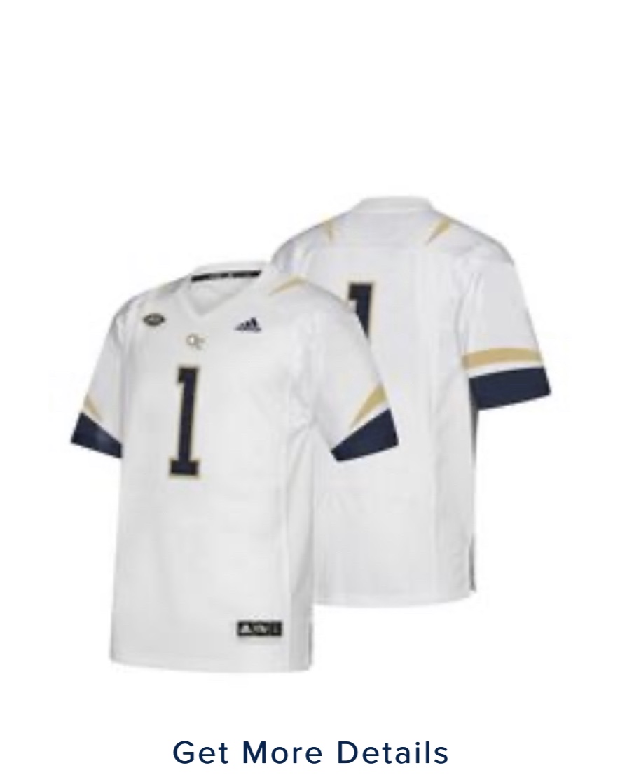
And that's why the numbers should be black, as the were when I was in school, or deep navy, either with a gold or white outline.
 

GTLorenzo

Helluva Engineer
Messages
1,553
As noted previously on this thread, I was in the lower level at the Clemson game and couldn't read the numbers. It's comical.

And traditionally, going back to the 70s at least and excluding the "black" era in the 80s, our numbers and shoulder stripes were navy blue. They were clear, legible and looked great as a uniform. Unfortunately, we've looked like a cluster **** for most of the last 20 years with stingers, and varying colors of uniforms in general, jerseys, pants, helmets, chicken wire, etc. My wife is a Clemson alum and I hate their orange, but when you see it, you know it is Clemson. We have been confusing ourselves with the MAC the last 10+ years at least.

And that's why the numbers should be black, as the were when I was in school, or deep navy, either with a gold or white outline.
 

chris975d

Ramblin' Wreck
Messages
903
And that's why the numbers should be black, as the were when I was in school, or deep navy, either with a gold or white outline.


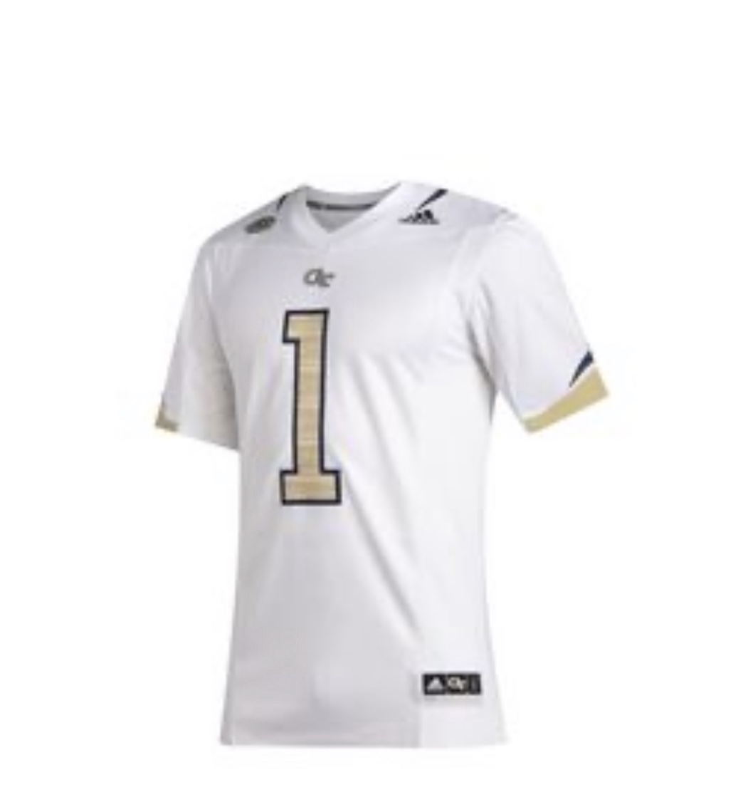
So I understand, of our current/recent jerseys, you like this one:

a3833d2810a7003d1d0b8b6c9bb3c342.jpg


vs this one?

f87304b15bea46b34a1923e8d14aaf43.jpg


If so, doesn’t the blue/black stand out way more than the white or gold? And make it look like the dark color is a predominant color?


As noted previously on this thread, I was in the lower level at the Clemson game and couldn't read the numbers. It's comical.

And traditionally, going back to the 70s at least and excluding the "black" era in the 80s, our numbers and shoulder stripes were navy blue. They were clear, legible and looked great as a uniform. Unfortunately, we've looked like a cluster **** for most of the last 20 years with stingers, and varying colors of uniforms in general, jerseys, pants, helmets, chicken wire, etc. My wife is a Clemson alum and I hate their orange, but when you see it, you know it is Clemson. We have been confusing ourselves with the MAC the last 10+ years at least.

I agree on the confusing different colors/shades we have used. We still can’t even have apparel (gold) match. Look across the bookstore. We have light yellow, straw, wheat, sand, none of the golds match. And none of those match our helmets. Clemson orange seems to be the same no matter who makes it or what it’s on.

And on top of that, we have a mascot that can’t be our actual colors. A gold and white buzz doesn’t work. He can’t even be gold! A yellow jacket is YELLOW and black. So there’s a whole different “buzz” gold for him (aka cheddar yellow). Now, if you make a shirt in Adidas gold (aka light brown “sand”), you can’t put a cheddar yellow and black buzz on it.

Our colors are as screwed up as the Auburn War Eagle/Tigers/Plainsmen stuff.
 

rfripp68

Georgia Tech Fan
Messages
57
Tidbit about navy selling well re: Dallas Cowboys uniforms

When shopping for Cowboys gear, all you see is navy, white and silver. No royal blue. There’s a reason for that, and it directly impacted Dallas’ decision to shift from royal to navy.

“Navy has been more popular in retail, and for us when we do so much of our sideline products, whether it’s polos or hats or T-shirts, a lot of that royal color – which is what the Cowboys used to be – has kind of transitioned to navy just because it does so much better at retail,” McCord said.
 

chris975d

Ramblin' Wreck
Messages
903
Tidbit about navy selling well re: Dallas Cowboys uniforms

Lol. I'm not wrong about it. Navy will usually top the sales of any other color something is made in. I see it all the time in apparel. Many times the navy colorway of something will sell out at the manufacturer level long before any other color does, IF any others do. Talking about apparel in general here, not specifically Tech. Then we go and make it one of our "secondary" colors that totally overpowers our two very poor contrast primary colors.

To add...Adidas is the maker of our gold and our navy apparel, and they have their own website they sell apparel on. So we know for a fact they have both gold and navy apparel available, and as far as I know, the ONLY Tech gear that has hit their own website for sale has been navy. Don't you think the maker of all our "official" gear would know what is more popular to sell on their own site? If it was gold, it would be there in my opinion.
 
Messages
13,443
Location
Augusta, GA
So I understand, of our current/recent jerseys, you like this one:

a3833d2810a7003d1d0b8b6c9bb3c342.jpg


vs this one?

f87304b15bea46b34a1923e8d14aaf43.jpg


If so, doesn’t the blue/black stand out way more than the white or gold? And make it look like the dark color is a predominant color?


I agree on the confusing different colors/shades we have used. We still can’t even have apparel (gold) match. Look across the bookstore. We have light yellow, straw, wheat, sand, none of the golds match. And none of those match our helmets. Clemson orange seems to be the same no matter who makes it or what it’s on.

And on top of that, we have a mascot that can’t be our actual colors. A gold and white buzz doesn’t work. He can’t even be gold! A yellow jacket is YELLOW and black. So there’s a whole different “buzz” gold for him (aka cheddar yellow). Now, if you make a shirt in Adidas gold (aka light brown “sand”), you can’t put a cheddar yellow and black buzz on it.

Our colors are as screwed up as the Auburn War Eagle/Tigers/Plainsmen stuff.
As far as my personal preference, I like the second one with the gold number outlined in blue/black, but the first one stands out more from the stands. I still LOVE the uniforms of the 60s, when I was in school. Although the numbers are not highlighted in this photo, nor is the photo in color, it was a kick-azz uniform.

iu
 

chris975d

Ramblin' Wreck
Messages
903
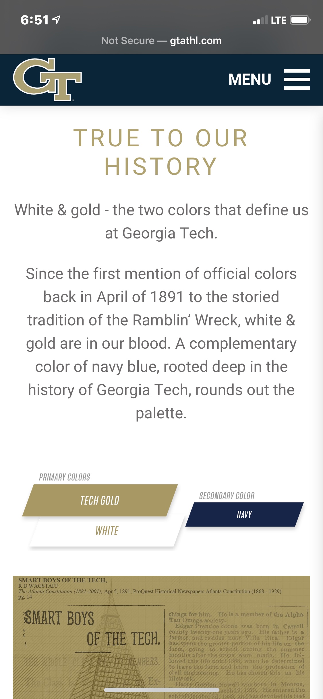
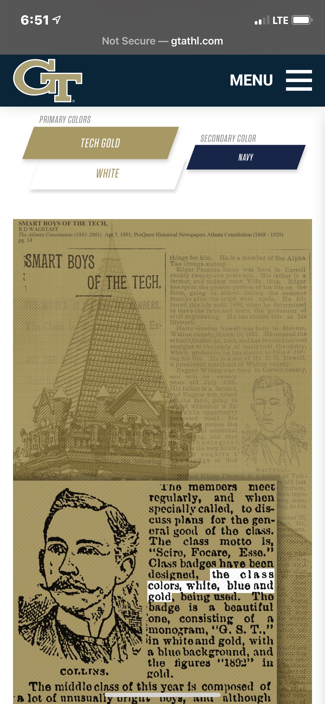
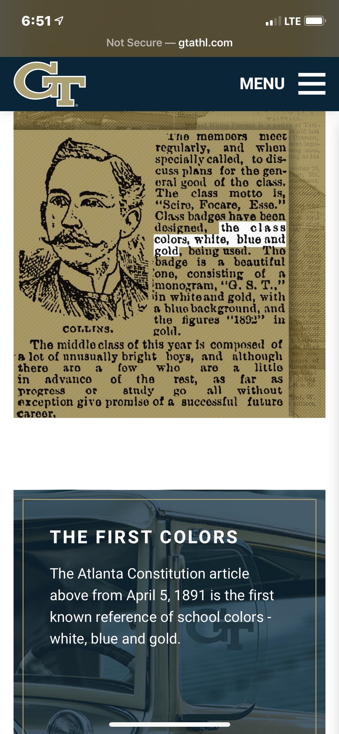
Getting back to the color issue, regarding navy blue vs black as a secondary color, is this where we first got the blue secondary color from? It’s on www.gtahtl.com, and it references a 1891 AJC article where our colors are mentioned as white, blue, and gold. Screenshots here, in order as you scroll down the page.

2a516f84288b64d98e0142d82d6d22f4.jpg

419acb985176a418d882d221001df56b.jpg

79d82ea43172ff5ae273c26250ea5634.jpg
 
Messages
13,443
Location
Augusta, GA
Getting back to the color issue, regarding navy blue vs black as a secondary color, is this where we first got the blue secondary color from? It’s on www.gtahtl.com, and it references a 1891 AJC article where our colors are mentioned as white, blue, and gold. Screenshots here, in order as you scroll down the page.

2a516f84288b64d98e0142d82d6d22f4.jpg

419acb985176a418d882d221001df56b.jpg

79d82ea43172ff5ae273c26250ea5634.jpg
If you will notice, and it's highlighted, so you SHOULD notice, it says the CLASS colors were gold, white, and blue. EVERY CLASS HAD ITS OWN COLORS. This says absolutely nothing about the school colors. And yet TStan went out of his way to use this bogus article to back up the so-called long-term use of blue.
 

dtm1997

Helluva Engineer
Featured Member
Messages
15,708
If you will notice, and it's highlighted, so you SHOULD notice, it says the CLASS colors were gold, white, and blue. EVERY CLASS HAD ITS OWN COLORS. This says absolutely nothing about the school colors. And yet TStan went out of his way to use this bogus article to back up the so-called long-term use of blue.

It's worked out well. The use of blue has looked good. Glad we're going to use it long term.
 

chris975d

Ramblin' Wreck
Messages
903
If you will notice, and it's highlighted, so you SHOULD notice, it says the CLASS colors were gold, white, and blue. EVERY CLASS HAD ITS OWN COLORS. This says absolutely nothing about the school colors. And yet TStan went out of his way to use this bogus article to back up the so-called long-term use of blue.

I understand. I’m just wondering this is what they (GTAA) are basing the heavy use of blue on?
 

White_Gold

GT Athlete
Messages
314
Location
Dahlonega
As noted previously on this thread, I was in the lower level at the Clemson game and couldn't read the numbers. It's comical.

And traditionally, going back to the 70s at least and excluding the "black" era in the 80s, our numbers and shoulder stripes were navy blue. They were clear, legible and looked great as a uniform. Unfortunately, we've looked like a cluster **** for most of the last 20 years with stingers, and varying colors of uniforms in general, jerseys, pants, helmets, chicken wire, etc. My wife is a Clemson alum and I hate their orange, but when you see it, you know it is Clemson. We have been confusing ourselves with the MAC the last 10+ years at least.

Before Dabo I’d get them confused for Cuse
 

IronJacket7

Helluva Engineer
Messages
2,556
https://comm.gatech.edu/brand/colors

gold-jerseys-4-fb-2019-1024x684.jpg

EFO5ppZXoAASNXv.jpg

042719 tech photos HS01.JPG


Can someone please tackle whoever is doing our branding? I am unsure if we missed a turn somewhere or what is going on but color scheme seems to have derailed again. I know I am splitting frog hairs here. The spring game uniforms were on point. But the citadel game uniforms (helmets were awesome jerseys not) and now these brass looking face masks..... Can someone please do something? I thought it was gonna be "Tech Gold" across the board?
 
Top