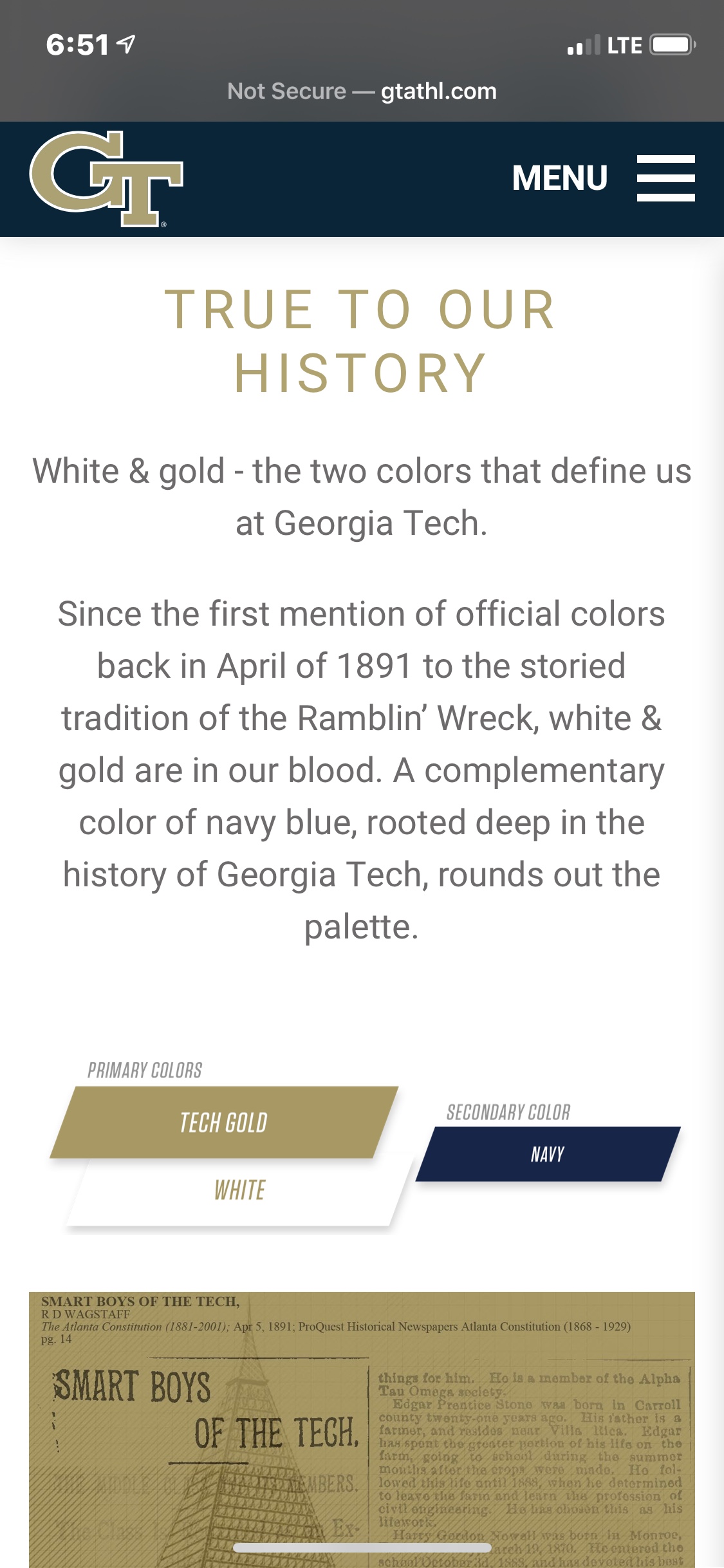
It actually is absolutely that way. As someone who has been on the retail side of apparel for 25 years, we do have catalogs with the different colorways available. And this is clear in that the same styles are showing up in different colors at Kohl’s, the bookstore, Fanatics, and Dicks for example. There are gold and navy options in almost every popular selling piece that Adidas has released. Yet the big box stores typically only stock the navy option. Why? Because the industry has mountains of data that navy is one of, if not THE best selling colorway of anything you make in navy. Polos, outerwear, pants, socks, underwear, whatever. These buyers for these large chains aren’t in touch with what the die hard GT fans wants, they see “navy” and they order it. I’ll almost bet my life on this...I talk to too many apparel reps for this not to be the case. Even the ones that actually do like Tech gear will tell you when recommending an order to “make most of it navy....it sells through better”.
In a perfect world, I’d love for all of our stuff to be only gold and white. But I think our colors actually hurt us for that. Those colors do not translate well to team uniforms. Those two colors only, in either combo (gold numbers and white shirts, or vice versa) don’t have enough contrast for legibility. You have to throw a contrast border color in there to make the numbers stand out. And even when you do that, as has been said of the white tops with gold numbers and navy outline, even they can be hard to read. And if you made the “gold” a true metallic/reflective color, it would make the numbers even harder to read. Penn St, Bama, other x/white color schools have a lot of contrast between white and the main color. It’s easier to do just two color uniforms with them. If we put uniforms on the field that were somehow JUST white and gold, no other contrast color, and that’s what was shown on tv, I can guarantee that the average casual/“street” fan would buy more white/gold. But when they see navy as a fairly predominant color of Tech uniforms on tv, and navy being such a popular color in general, things are going to get made in navy.
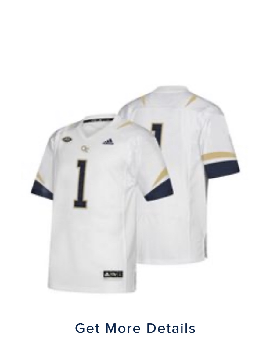
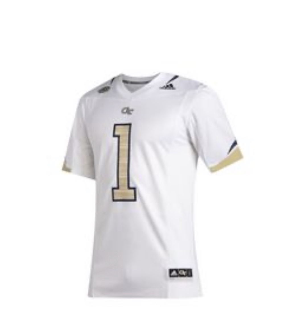
And from the manufacturers side, which I do have the benefit of hearing from, gold is a very hard color to make apparel into. Look at the actual names of our “gold” across different apparel makers...it’s “sand”, or “straw”, or “wheat” or such names. Its a yellow/khaki color. It’s not representative of the actual color on the helmets, and can’t be.