Hey is it time to talk Uni's

Vespidae

Helluva Engineer
Messages
5,326
Location
Auburn, AL
I personally prefer the "Notre Dame" look ... gold pants, helmet.

Still, because of white home jerseys, we rarely see and solid colors .. which in turn, affects merchandising.

I've warmed up to wearing gold as the primary home jersey and white as primary road jersey. Both with white pants.

 

JacketFromUGA

Helluva Engineer
Messages
4,897
Could be worse

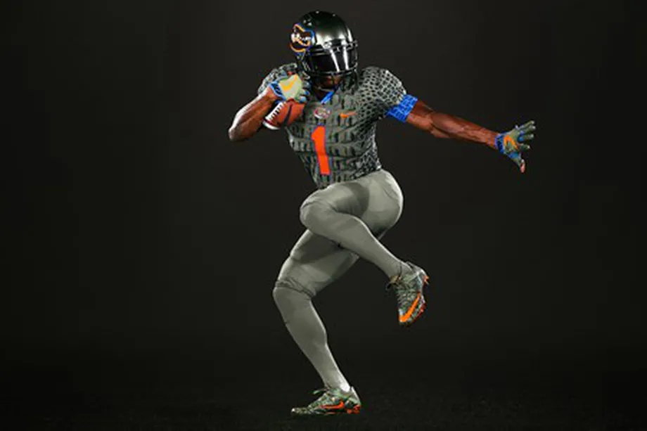
https://www.alligatorarmy.com/2017/...ternate-uniforms-swamp-green-alligator-scales

Failure.0.jpg
 

IEEEWreck

Ramblin' Wreck
Messages
656
inane question:

The gold honeycomb on white fades into an indistinct pattern at a distance because the white is dominant and gold isn't a strong enough contrast to show the lines that are like 10% of fill.

Why don't we do white lines on a gold background? Has anyone tried? Is that just obviously hideous or something? It seems like it would actually look like a honeycomb.
 

TheSilasSonRising

Helluva Engineer
Messages
3,729
Those that were there know, but the field logos actually had a gold surround.

I hope Adidas can come up with some really sharp Triple White designs for us. That is a very unique hone team look.

And, besides traditional Gold/White/Gold, I hope they can do a great White /Gold/White as well.
 

dressedcheeseside

Helluva Engineer
Messages
14,218
A darker and "flatter" shade of gold will be more visually dominating than the lighter shades often displayed. The orange tinted yellow also "pops" more but dang it's butt ugly.

I'm hoping for a darker flatter shade. White numerals on that shade of gold would be more visible, ditto gold numerals on white. Downside would be navy numerals on darker shade of gold would be uglier....but could still use navy numerals on white if we want.
Mustard?
 
Top