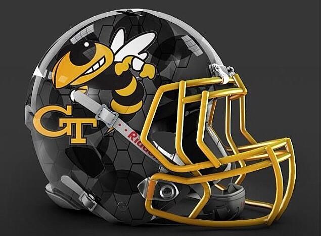
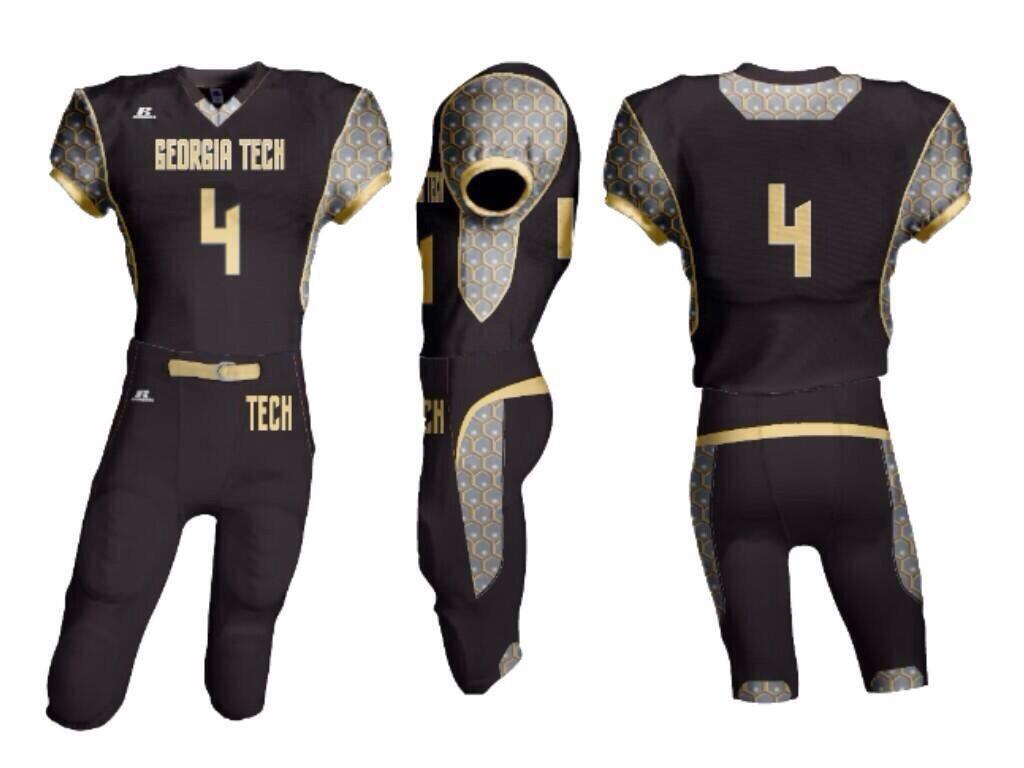
JBR.....it's near impossible. Have you paid any attention to how many differing opinions on what the correct shade of gold even is for GT? It varies greatly from what I have seen. And none of those who whine about color / design are ever satisfied by anything other than what their own like and opinion is.
The amount of uni whining that comes from GT fans truly amazes me. I can get how some hated the 08 uni. It had radical new design changes and was a dark old gold in color. The green shades making up that old gold color stood out, fairly significantly, when displayed on TV sets. Was not so greenish in appearance in person but others have disagreed with me on that point. 09 had same style but was closer to a vegas gold color. The bubble wrap was another fairly significant design change and I get the angst and criticism on that one too. I didn't love any of the above but none made me butthurt over them.
As for the other unis...I'm a bit amazed at the vitriol spewed about them. I haven't loved all of the design elements of each but nothing about them made me hate them. Last year's uni, and this year's apparently, are pretty dang conservative. Mostly white jersey (blue numbers), and gold pants (white stripe down side). There is a stripe at the shoulders of the jersey but it is pretty minimal. The stripe on the pants isn't traditional, i.e. straight down the seam. Other than those two stripes....fairly minimal design elements and conservative ones IMO....it sure looks like a Tech uni to me.
But we are all entitled to our own opinions on the matter. So please feel free to carry on with any whining that makes you feel better. (I also think most whiners would love our current uni if it only displayed a gold (or white) swoosh somewhere on it. The swoosh seems to be the defining element in what makes a good looking jersey for many.


