cyptomcat
Ramblin' Wreck
- Messages
- 866
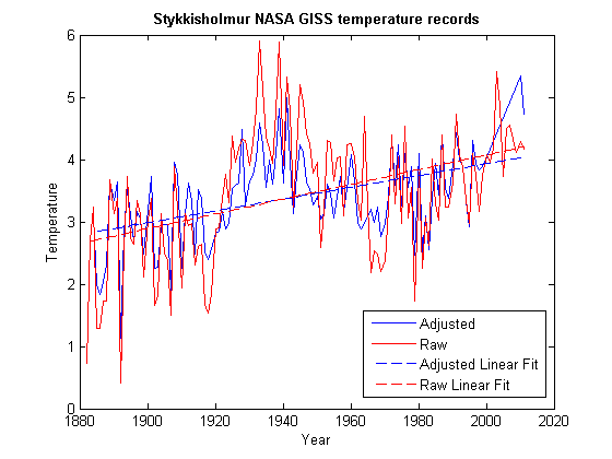
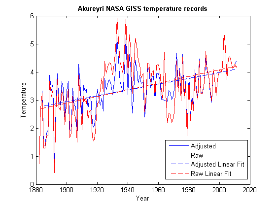
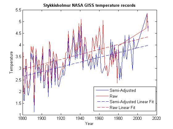
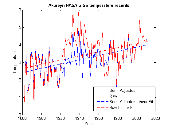
Here are the plots with the linear fits for Iceland stations with graphs in the article. They are not perfect, they could use some
cleaning up, but it's using the time frame for the available raw data. I didn't choose any of the ranges, Matlab did it automatically.
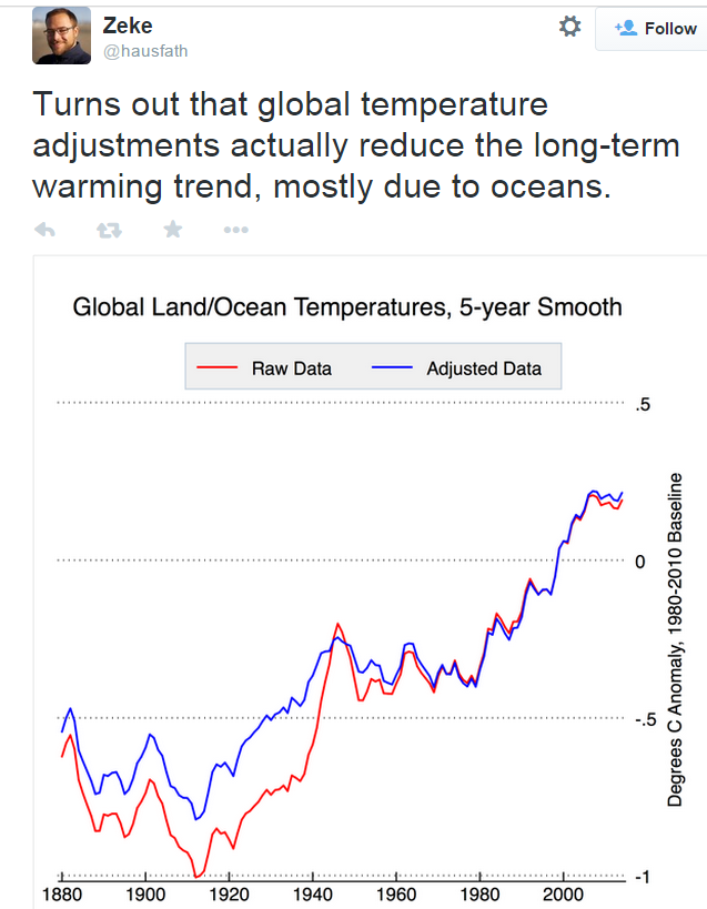
I called the adjusted data Homewood uses as 'semi-adjusted', because it hasn't gone through all the adjustments. What I call
'adjusted' is the data after all the adjustments (data used in OP post for example.)
cleaning up, but it's using the time frame for the available raw data. I didn't choose any of the ranges, Matlab did it automatically.
I called the adjusted data Homewood uses as 'semi-adjusted', because it hasn't gone through all the adjustments. What I call
'adjusted' is the data after all the adjustments (data used in OP post for example.)