dressedcheeseside
Helluva Engineer
- Messages
- 14,218
Apparently a lot of folks.Who cares about stripes, bars, slashes, honeycombs, stitched on numerals, etc.?
Apparently a lot of folks.Who cares about stripes, bars, slashes, honeycombs, stitched on numerals, etc.?
Can we please kill this thread? Let's all just resolve to pull for the guys in white and gold (whatever hues they end up being). The good guys. Who cares about stripes, bars, slashes, honeycombs, stitched on numerals, etc.? You don't like our uniforms? Punch a UGA fan in the nose. (He probably deserves it, anyway.) Let's cheer for our guys to beat the snot out of the Terriers, Green Wave, Eagles, Hokies, Hurricanes, Blue Devils, Tar Heels, Panthers, Cavaliers, Wolfpack, Tigers, and Bulldogs. I'm proud of my Institution regardless of what the design of our football uniforms are. You should be too. Quit complaining.
FIFYUnfortunately a lot of folks.
I'll quit complaining when you start caring...
.
A lot of Tech folks don't care to see us looking like clowns on the football field. I'd say that's a good thing.FIFY
Sorry, just couldn't resist. I'm hoping this years unis will end all the controversy, and I know you care.Hillary??? Now that hurts.
Go big or go home! Its better to win in a flamboyant uni than a boring one.The only thing worse than losing, is losing in a ridiculous looking uniform.
Here's where this type of thread gets derailed for me. The demeaning comments like calling our recent uniforms "bubble wrap" because you don't like them over and over start to get old. I'm all for tradition. I love Penn State's uniforms, but we don't have a uniform tradition at Tech. Each era has had very different looks.A lot of Tech folks don't care to see us looking like clowns on the football field. I'd say that's a good thing.
Go big or go home! Its better to win in a flamboyant uni than a boring one.

Nobody is trying to demean GT by calling the uni's bubblewrap. That's just what they looked like, especially from a distance. It's really bad graphic design fundamentals. I know, I took graphic design as part of my ID degree at GT, no less. The way they tried to give the 3D look with the reflection is what does it. They would have been much better off going with a 2D representation like they did on the helmets.Here's where this type of thread gets derailed for me. The demeaning comments like calling our recent uniforms "bubble wrap" because you don't like them over and over start to get old. I'm all for tradition. I love Penn State's uniforms, but we don't have a uniform tradition at Tech. Each era has had very different looks.
Many of the older set talk about Dodd's uniforms, but his uniforms changed too. I actually like the hexagonal pattern on the uniforms. I think it's fresh and innovative. And from what I've heard, the current players and recruits actually like them too. As a metallurgical engineer, the pattern reminds me of a lattice structure, which brings me right back to my Tech days. You may think that's nerdy, but for me, it serves it's purpose [building a visual connection between the team and the school in the fan's mind].
I have no problem with you guys that pine for the throw-backs, but to constantly listen to you all ridicule what we have worn recently saying we look ridiculous should be tempered. I know I can ignore the thread, but I want to contribute my opinion too. I like the "honeycomb" and wouldn't mind seeing it stay. I tend to be even more traditional when it comes to helmets, but I really like the hex pattern on the helmet. To me it doesn't look cheesy or cheap. It looks innovative.

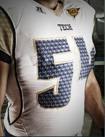
I didn't mean to imply that you all were demeaning GT, just the uniforms. I fully believe the desire for different uniforms are an interest in elevating GT's image. For the record, I don't like the hex in the numbers. I like the shoulders and helmets. I'm all for solid numbers.Nobody is trying to demean GT by calling the uni's bubblewrap. That's just what they looked like, especially from a distance. It's really bad graphic design fundamentals. I know, I took graphic design as part of my ID degree at GT, no less. The way they tried to give the 3D look with the reflection is what does it. They would have been much better off going with a 2D representation like they did on the helmets.

close up, it's not as bad, but it's still bad. From a distance.... it's bubble wrap.
For the record, I don't like the hex in the numbers. I like the shoulders and helmets. I'm all for solid numbers.
Here's where this type of thread gets derailed for me. The demeaning comments like calling our recent uniforms "bubble wrap" because you don't like them over and over start to get old. I'm all for tradition. I love Penn State's uniforms, but we don't have a uniform tradition at Tech. Each era has had very different looks.
Many of the older set talk about Dodd's uniforms, but his uniforms changed too. I actually like the hexagonal pattern on the uniforms. I think it's fresh and innovative. And from what I've heard, the current players and recruits actually like them too. As a metallurgical engineer, the pattern reminds me of a lattice structure, which brings me right back to my Tech days. You may think that's nerdy, but for me, it serves it's purpose [building a visual connection between the team and the school in the fan's mind].
I have no problem with you guys that pine for the throw-backs, but to constantly listen to you all ridicule what we have worn recently saying we look ridiculous should be tempered. I know I can ignore the thread, but I want to contribute my opinion too. I like the "honeycomb" and wouldn't mind seeing it stay. I tend to be even more traditional when it comes to helmets, but I really like the hex pattern on the helmet. To me it doesn't look cheesy or cheap. It looks innovative.
Nobody is trying to demean GT by calling the uni's bubblewrap. That's just what they looked like, especially from a distance. It's really bad graphic design fundamentals. I know, I took graphic design as part of my ID degree at GT, no less. The way they tried to give the 3D look with the reflection is what does it. They would have been much better off going with a 2D representation like they did on the helmets.
PREACH ON BRUDDA...............THEY ARE BAD !

close up, it's not as bad, but it's still bad. From a distance.... it's bubble wrap.
I could live with that Uni...........like Dodd better but that is a good look !This is a football jersey.....

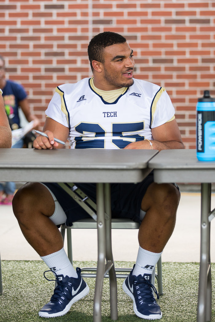
Me at Fan Day.
Noticed the same thing. But for whatever reason, I feel like uniforms change every year, and the fact that there are absolutely no changes makes me think the ones at fan day are not the unis this year.So if you look at the unis from fan day, they have the new ACC logo on them... Doubt they would stitch that on some re-treads.
Looks like those are our jerseys... Not bad!

