You are using an out of date browser. It may not display this or other websites correctly.
You should upgrade or use an alternative browser.
You should upgrade or use an alternative browser.
GT Primary Colors debate
- Thread starter AUFC
- Start date
Schlandy
Georgia Tech Fan
- Messages
- 56
I wish our third color was green. Looks so cleanNotre Dame has started leaning a little more into the kelly green look as they are the only team in FBS with that color (aside from Marshall). They wore it for their most high profile game last season.
View attachment 16461
Bogey
Helluva Engineer
- Messages
- 1,722
What about Michigan State green?Notre Dame has started leaning a little more into the kelly green look as they are the only team in FBS with that color (aside from Marshall). They wore it for their most high profile game last season.
View attachment 16461
More of a forest green. I looked up Hawaii last night when I made that post and they are also more of a forest green.What about Michigan State green?
stinger78
Helluva Engineer
- Messages
- 4,300
I like the one on the right better. The dark blue trim is good, and a classic Tech look. We wore that combo in the 60’s when I was a yiunh lad.Threw this together a while back. I know it looks crappy I’m not great at PS, but this is what should be happening as far as shades are concerned
I’ll add the og for comp
View attachment 16462
stinger78
Helluva Engineer
- Messages
- 4,300
But what PMS is it?More of a forest green. I looked up Hawaii last night when I made that post and they are also more of a forest green.
Vespidae
Helluva Engineer
- Messages
- 5,326
- Location
- Auburn, AL
I count five logos ... how long before we go full Nascar?
Ramble1885
proud sidewalk fan
- Messages
- 1,903
- Location
- Atlanta
I like our current navy. It’s not true navy blue it’s actually hex code #013057We can't even agree on what shade of blue we want on this board. Blue, dark blue, and navy blue have all been mentioned.
I think navy is a good accent color for us, and btw for those who don’t think it’s a “true” tech color… we’ve worn navy tops in football occasionally dating back to the 40’s. Clint Castleberry ran over mfos in navy.
Ramble1885
proud sidewalk fan
- Messages
- 1,903
- Location
- Atlanta
Okay while I’m happy with you changing the shade of gold to be consistent… DO NOT ELIMINATE THE NAVY SLEEVE STRIPE. That simple classic gold stripe + empty space + navy stripe pattern on the sleeves is one of my favorite things about our uniform. It’s so classic.Threw this together a while back. I know it looks crappy I’m not great at PS, but this is what should be happening as far as shades are concerned
I’ll add the og for comp
View attachment 16462
stinger78
Helluva Engineer
- Messages
- 4,300
White and Gold. Good to see GT still knows our colors.
Pretty funny they still wouldn’t put a gold item in the graphic
Their messaging is so contradictory and confusing. Who found that web page listing “navy” blue as a primary color? Get it right, GT!
DeepSnap
GT Athlete
- Messages
- 458
- Location
- Hartselle, AL
Surprised no one has mentioned the $$$$ efforts of the late Charlotte banker Drew Hearn (for those who came in late, yes, the father of C Andy Hearn, 1984-1985) in the '80s & '90s to persuade Curry, Ross, Cremins, et al, to eliminate blue from our uni's.
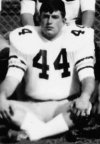
Our 1968 Freshman Team wore the Dodd-era (used by Carson for 1967 only) Varsity uni's - here's a cropped shot of my late teammate late Jeff "Boom Boom" Baker - with black numbers and the three stripes were black-gold-black.
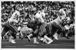
Fulcher brought back a version in 1972-1973, but with only two stripes.... and I won't get into the argument over black vs blue.... I just don't remember.... but the "names on the jersey" was a Fulcher add-on for the "locker room."
Here's a crop shot of of former Coca Cola exec, Karl "PeeWee" Barnes wearing that uni....

.... and a better look from a game
Our 1968 Freshman Team wore the Dodd-era (used by Carson for 1967 only) Varsity uni's - here's a cropped shot of my late teammate late Jeff "Boom Boom" Baker - with black numbers and the three stripes were black-gold-black.

Fulcher brought back a version in 1972-1973, but with only two stripes.... and I won't get into the argument over black vs blue.... I just don't remember.... but the "names on the jersey" was a Fulcher add-on for the "locker room."
Here's a crop shot of of former Coca Cola exec, Karl "PeeWee" Barnes wearing that uni....

.... and a better look from a game

stinger78
Helluva Engineer
- Messages
- 4,300
deepsnap, I do believe that Fulcher's sleeve stripes were dark blue, but the stripes on the helmet and pants were black. I know Pepper's sleeve stripes were dark blue but cannot be totally sure about Fulcher's. I do know the last few Dodd jerseys were black sleeve and pants stripes and numbers.Surprised no one has mentioned the $$$$ efforts of the late Charlotte banker Drew Hearn (for those who came in late, yes, the father of C Andy Hearn, 1984-1985) in the '80s & '90s to persuade Curry, Ross, Cremins, et al, to eliminate blue from our uni's.
Our 1968 Freshman Team wore the Dodd-era (used by Carson for 1967 only) Varsity uni's - here's a cropped shot of my late teammate late Jeff "Boom Boom" Baker - with black numbers and the three stripes were black-gold-black.
View attachment 16515
Fulcher brought back a version in 1972-1973, but with only two stripes.... and I won't get into the argument over black vs blue.... I just don't remember.... but the "names on the jersey" was a Fulcher add-on for the "locker room."
Here's a crop shot of of former Coca Cola exec, Karl "PeeWee" Barnes wearing that uni....
View attachment 16514
.... and a better look from a game
View attachment 16516
RonJohn
Helluva Engineer
- Messages
- 4,994
My understanding from a few years ago was that gold is difficult to coordinate and match on different materials. True or not true I don't know, but what was said is that the same shade of gold paint looks different on metal, plastic, fabric, and even different fabrics. I remember that the gold paint on the basketball court looked green on the TV screen, but didn't in person.Threw this together a while back. I know it looks crappy I’m not great at PS, but this is what should be happening as far as shades are concerned
I’ll add the og for comp
View attachment 16462
bobongo
Helluva Engineer
- Messages
- 7,572
Probably few if any remember it but you. Thanx for all the historical perspective you provide, DeepSnap. I was certainly unaware of any such pecuniary incentives relating to uniform color.Surprised no one has mentioned the $$$$ efforts of the late Charlotte banker Drew Hearn (for those who came in late, yes, the father of C Andy Hearn, 1984-1985) in the '80s & '90s to persuade Curry, Ross, Cremins, et al, to eliminate blue from our uni's.
LongforDodd
LatinxBreakfastTacos
- Messages
- 3,191
How would you describe the gold on the helmets in the third picture? Has anything been created in the past ten years that matches?Surprised no one has mentioned the $$$$ efforts of the late Charlotte banker Drew Hearn (for those who came in late, yes, the father of C Andy Hearn, 1984-1985) in the '80s & '90s to persuade Curry, Ross, Cremins, et al, to eliminate blue from our uni's.
Our 1968 Freshman Team wore the Dodd-era (used by Carson for 1967 only) Varsity uni's - here's a cropped shot of my late teammate late Jeff "Boom Boom" Baker - with black numbers and the three stripes were black-gold-black.
View attachment 16515
Fulcher brought back a version in 1972-1973, but with only two stripes.... and I won't get into the argument over black vs blue.... I just don't remember.... but the "names on the jersey" was a Fulcher add-on for the "locker room."
Here's a crop shot of of former Coca Cola exec, Karl "PeeWee" Barnes wearing that uni....
View attachment 16514
.... and a better look from a game
View attachment 16516
- Messages
- 12,102
- Location
- Marietta, GA
White and Gold. Good to see GT still knows our colors.
Pretty funny they still wouldn’t put a gold item in the graphic
Nope, not white and gold... It's obviously Gold and White!
